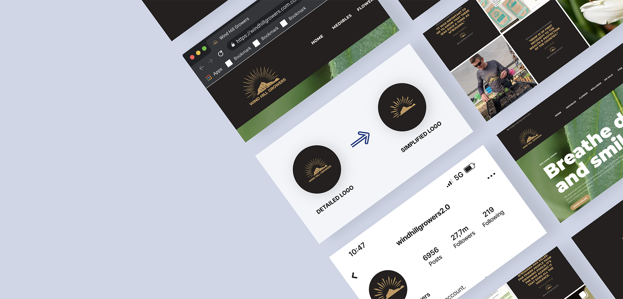
Wind Hill Growers faced a crucial problem: they had been using the same logo for almost a decade. However, the logo's intricate details were becoming hard to distinguish on smaller screens. This issue caused thumbnails and profile pictures to appear blurry, making the brand less recognizable.
The owners were deeply attached to their logo, as it had been with them for nearly a decade and held special significance—it represented Mt. Washington, the mountain overlooking their farm. They acknowledged the problem and wanted to address it creatively.
They agreed to use a simplified version of the logo for thumbnails, profile pictures, and smaller screens while keeping the detailed version for large screens and prints.
As a UX Designer, I identified the problem and brought it to the stakeholders. After presenting the issue and convincing them to take action, I collaborated closely with the stakeholders and a German designer. Together, we iterated on potential solutions for the simplified logo until arriving at a version that satisfied the stakeholders.